








Tips for Choosing Calm Colors to Create a Relaxing Home
Creating a peaceful and relaxing atmosphere in your home often starts with the colors you choose. Calm colors can transform any space into a soothing retreat where you feel comfortable and at ease. But with so many options available, how do you pick the right shades that truly promote tranquility? This guide will walk you through helpful tips to select calm colors for your home, making it a serene sanctuary you’ll love.
Why Choose Calm Colors?
Calm colors are typically soft hues that evoke a sense of peace and relaxation. They can reduce stress, improve mood, and create an inviting environment. Spaces painted with calm colors tend to feel more open, airy, and restful compared to those with bold or harsh tones.
Common Calm Color Families
– Blues: Known for their calming effect, blues mimic the sky and water. Light blues, in particular, can help reduce anxiety and promote serenity.
– Greens: Green symbolizes nature and renewal, evoking feelings of balance and harmony.
– Neutrals: Soft grays, beige, and greige offer understated elegance and flexibility, creating a peaceful backdrop for any decor.
– Soft Pinks and Lavenders: These gentle pastels can add warmth and comfort without overwhelming a space.
Tips for Choosing Calm Colors
1. Consider the Room’s Purpose
Think about how you use each room and what kind of mood you want to create. For example:
– Bedroom: Opt for soft blues, gentle greens, or muted lavenders to foster relaxation and restful sleep.
– Living Room: Choose warm neutrals or calming greens to make the space welcoming and peaceful for family gatherings.
– Bathroom: Light blues or seafoam greens can create a spa-like atmosphere.
– Home Office: Soft grays or muted blues help maintain focus without causing strain.
2. Test Samples in Different Lighting
Colors can look very different depending on lighting conditions. Always test paint swatches on your walls and observe them at various times of day:
– Morning sunlight tends to enhance cooler tones.
– Afternoon light can warm up colors, making some shades feel more inviting or intense.
– Artificial lighting will also impact a color differently depending on whether it’s warm or cool light bulbs.
Seeing colors in context ensures you pick a shade that maintains its calmness regardless of lighting.
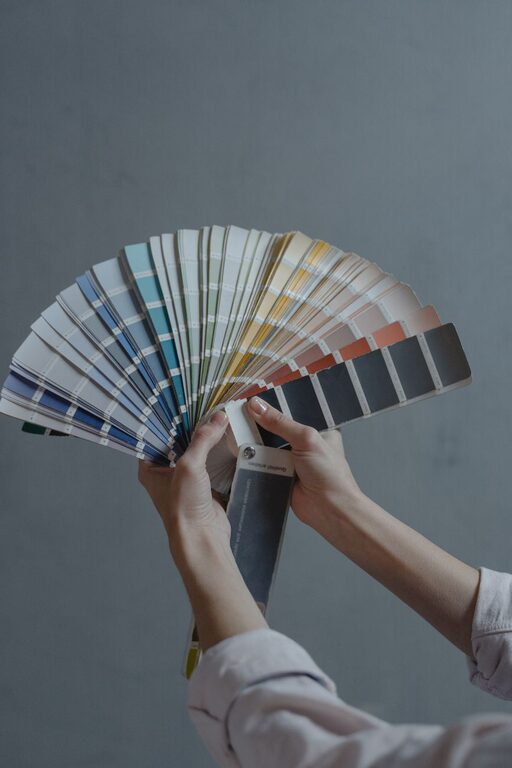
3. Use Color Swatches and Mood Boards
Create a mood board with swatches, fabric samples, and images to visualize how colors work together. This is especially helpful if you plan to incorporate multiple calm colors throughout your home. Complementary or analogous colors—those next to each other on the color wheel—often create harmonious, serene palettes.
4. Balance Color Intensity
Too much saturation can overwhelm a space, while too little might feel bland. Choose softer versions of your preferred color by adding white or gray to tone it down. For example:
– Instead of bright yellow, try a pale buttery shade.
– Instead of deep teal, consider a faded blue-green.
Balancing intensity helps maintain calmness while adding personality.
5. Think About Finish and Texture
The finish you select can affect the mood as much as the color itself. Matte or eggshell finishes provide a soft, understated look that enhances calmness. On the other hand, glossy or high-sheen finishes reflect more light, which might add energy rather than relaxation.
Additionally, combining calm colors with textured materials—like linen curtains, woven rugs, or natural wood—can enrich the room without disrupting the peaceful vibe.
6. Coordinate with Existing Furniture and Decor
Consider your current furniture, artwork, and decor pieces before choosing colors. Calm colors should complement your style rather than clash with it. Neutral colors like beige, soft gray, and muted greens tend to blend well with a variety of furnishings, making future updates easier.
7. Use Accent Colors Sparingly
While calm colors should dominate your space, small pops of accent color can add interest and prevent monotony. Choose muted or pastel accents to maintain the serene feel. For instance, a navy cushion in a pale blue room or a dusty rose vase on a beige shelf can provide subtle focal points.
Popular Calm Color Combinations
Here are a few tried-and-true combinations to inspire your next paint project:
– Soft Blue + Warm White: Classic and timeless, this duo brightens a room while keeping it peaceful.
– Sage Green + Cream: Earthy and relaxing, perfect for living rooms and bedrooms.
– Light Gray + Pale Pink: Elegant and gentle, ideal for calming bedrooms or cozy reading nooks.
– Lavender + Soft Taupe: Adds warmth and tranquility, especially in bathrooms or home offices.
Final Thoughts
Choosing calm colors for your home is a wonderful way to cultivate a tranquil environment that supports relaxation and well-being. Take your time exploring different shades, test them in your space, and consider the overall mood you want to achieve. With the right colors, you can create a serene haven that feels just right for you and your family.
Happy decorating!